Market Structure
Stablecoins Quietly Broke Bitcoin Dominance
 Victoria· Editors & Writers
Market Structure · Aug 30, 2026
Market StructureDominance
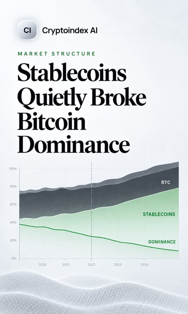
When traders sell alts into stables, headline dominance can fall. The ratio stopped measuring the risk market the moment cash became a large slice of the total.
Bitcoin dominance is one line of arithmetic: bitcoin's market cap divided by the total crypto market cap. It has been quoted in every market report since 2013, and for most of that time it meant what people thought it meant.
It stopped meaning that somewhere around the point when stablecoins became a meaningful share of the denominator.
Today, when you read that dominance is around 57%, you are reading a ratio where a large slice of the bottom half is dollar liabilities that were never competing with bitcoin for anything. The number still moves, still gets quoted, and now answers a slightly different question than the one being asked.
The Denominator Problem
Here is the thing that makes this awkward rather than obvious.
Dominance is supposed to answer: how much of the crypto risk market is bitcoin? That is a question about competing speculative assets. When it falls, the implied story is that capital rotated into altcoins.
But total crypto market cap includes USDT, USDC and every other stablecoin. Those are not competing speculative assets. They are, functionally, the cash on the sidelines.
So consider what happens when traders de-risk. They sell altcoins into stablecoins. Stablecoin supply expands. Total market cap barely falls, because the value moved from one line of the calculation to another. Bitcoin's market cap is unchanged. And dominance goes down.
Read that again. Traders moved to cash, which is a risk-off event, and the metric that supposedly measures flight to bitcoin registered the opposite.
The Second Problem: Wrapped Bitcoin
Smaller, but worth knowing because it runs in the same direction.
Tokens like WBTC are bitcoin held in custody and represented on another chain. The underlying asset is bitcoin. But standard market cap aggregations count the wrapper separately, so the same bitcoin appears twice: once inside BTC's market cap and once inside the altcoin total that sits in the denominator.
The effect is to understate dominance, consistently, by a modest amount. It is not large enough to change a conclusion on its own. It is large enough that if you are comparing dominance across periods when wrapped bitcoin supply changed a lot, you are not comparing like with like.
What to Use Instead
The fix is not complicated. Take stablecoins out of the denominator.
Ex-stablecoin dominance = BTC market cap ÷ (total market cap − stablecoin market cap)
That version answers the question people actually mean: of the money in crypto that is taking risk, how much is in bitcoin. The number comes out higher than the standard figure, and more importantly it moves for the right reasons.
When traders sell alts for stablecoins under this measure, the denominator shrinks along with the alt side, and dominance rises. Which is what a flight to bitcoin's relative position should look like.
The live standard print is on our bitcoin dominance page. Read it next to bitcoin’s own price - a ratio moving tells you nothing about which side moved.
Why Everyone Still Quotes the Broken One
Three reasons, none of them conspiratorial.
It is the default on every major aggregator. CoinMarketCap, CoinGecko and TradingView's BTC.D all publish the standard version most prominently. People quote what is in front of them.
It has the longest continuous history. Ex-stablecoin dominance is only interesting from roughly 2019 onward, when stablecoins became material. If you want a chart going back to 2013, the standard version is what exists.
The distortion was small until it was not. For years stablecoins were a rounding error in total market cap, and the two versions were nearly identical. The metric did not break on a specific date. It drifted out of usefulness gradually, which is the hardest kind of change to notice.
A Third Thing the Number Cannot Tell You
Even with the right denominator, dominance has a structural limitation that no adjustment fixes: it is a ratio, and a ratio moves when either side moves.
Falling dominance can mean altcoins rallied. It can also mean bitcoin fell while everything else fell less. Those are completely different market states and they produce an identical line on the chart.
Which is why dominance on its own is close to useless and dominance next to bitcoin's own price is genuinely informative:
| Dominance | BTC price | What it means |
|---|---|---|
| Rising | Rising | Bitcoin-led rally, capital entering through BTC |
| Rising | Falling | Risk-off, altcoins falling harder |
| Falling | Rising | Broadening rally, rotation into altcoins |
| Falling | Falling | Bitcoin underperforming a weak market |
Rows two and four are where people most reliably reach the wrong conclusion, because in both cases the headline direction suggests a story the price contradicts.
The Trendline Habit
One more thing worth pushing back on, since it is everywhere.
People draw support and resistance on the dominance chart as though it were a price chart. Trendlines, breakouts, retests, the whole apparatus.
Dominance is not an asset. There is no order book. Nobody is placing bids at 54% and defending them. The chart produces convincing-looking patterns because a ratio of two trending series always produces chart-like shapes, and human pattern recognition does the rest.
What holds up better is treating dominance as a regime label. Sustained readings above roughly 55 to 60% describe a market where capital concentrates in bitcoin. Sustained readings below 45% describe one where it disperses. Knowing which environment you are in is useful for how you size and allocate. Knowing that the line touched 57.4% twice is not.
The Short Version
Use the ex-stablecoin figure. Read it alongside bitcoin's price, always, because a ratio moving tells you nothing about which side moved. Treat it as a description of regime rather than a timing tool. And check it against a breadth measure like the altcoin season index before concluding a rotation is real, since dominance can fall on ether alone while forty other coins go nowhere.
The broader habit is the useful part. Any metric built as a ratio inherits everything that happens to its denominator, including changes nobody anticipated when the metric was designed. Stablecoins were not a category when bitcoin dominance was invented. They are now most of the reason the number needs an asterisk.
Frequently asked questions
Why do stablecoins distort bitcoin dominance? They sit in the denominator. When traders sell alts into USDT or USDC, total market cap barely falls and bitcoin’s share can drop even though nobody rotated into speculative alts.
What is ex-stablecoin dominance? Bitcoin market cap divided by total crypto market cap minus stablecoins. It measures bitcoin’s share of the risk market, not of cash-on-the-sidelines plus risk.
Does wrapped bitcoin matter? A little. Wrappers like WBTC are counted again in the alt total, so standard dominance is understated. The effect is modest, but it grows when wrapped supply changes a lot.
Where is the live dominance chart? On the Bitcoin dominance page. Read it next to bitcoin’s price and the altseason breadth count.
Cryptoindex.ai publishes index data and analysis for informational purposes. Nothing here is investment advice.